1. Bryn: The CLIMB portal
You can sign-up to CLIMB via bryn.climb.ac.uk but please note that the first user should be a principal investigator or independent investigator.
2. Launching a GVL server
3. Genomics Virtual Laboratory
The Genomics Virtual Laboratory is our standard ‘image’.
Launching a GVL server:
4. RStudio
RStudio is an online development environment for running R code:
-
RStudio Server provides access to RStudio and, by extension, R from within your browser.
-
Bring up GVL
-
Click on Rstudio
-
Input your “jupyter” log-in credentials
-
This should bring up an Rstudio interface.
From this interface you should be able to use R in a way that many of your will be familiar with.
Cars Plotting Example
Run these commands one-by-one. They will produce a number of different plots from the stock dataset cars.
The plots are produced by ggplot2 a powerful tool for plotting that uses the grammar of graphics.
This allows you to start with your base dataset and add plots layer by layer.
# Load the library
library(ggplot2)

# Line plot
ggplot(cars, aes(speed, dist))+ geom_line()

# Barchart
ggplot(cars, aes(speed, dist))+ geom_bar(stat="identity")

# Line plot on top of the bar plot
ggplot(cars, aes(speed, dist))+ geom_bar(stat="identity") + geom_line()
Some more advanced plotting using qplot (This tutorial was taken from http://www.statmethods.net/advgraphs/ggplot2.html):
# ggplot2 examples
library(ggplot2)

# create factors with value labels
mtcars$gear <- factor(mtcars$gear,levels=c(3,4,5),
  	labels=c("3gears","4gears","5gears"))
mtcars$am <- factor(mtcars$am,levels=c(0,1),
  	labels=c("Automatic","Manual"))
mtcars$cyl <- factor(mtcars$cyl,levels=c(4,6,8),
   labels=c("4cyl","6cyl","8cyl"))

# Kernel density plots for mpg
# grouped by number of gears (indicated by color)
qplot(mpg, data=mtcars, geom="density", fill=gear, alpha=I(.5),
   main="Distribution of Gas Milage", xlab="Miles Per Gallon",
   ylab="Density")

# Scatterplot of mpg vs. hp for each combination of gears and cylinders
# in each facet, transmittion type is represented by shape and color
qplot(hp, mpg, data=mtcars, shape=am, color=am,
   facets=gear~cyl, size=I(3),
   xlab="Horsepower", ylab="Miles per Gallon")

# Separate regressions of mpg on weight for each number of cylinders
qplot(wt, mpg, data=mtcars, geom=c("point", "smooth"),
   method="lm", formula=y~x, color=cyl,
   main="Regression of MPG on Weight",
   xlab="Weight", ylab="Miles per Gallon")

# Boxplots of mpg by number of gears
# observations (points) are overlayed and jittered
qplot(gear, mpg, data=mtcars, geom=c("boxplot", "jitter"),
   fill=gear, main="Mileage by Gear Number",
   xlab="", ylab="Miles per Gallon")
5. VNC Remove Desktop
-
Click the VNC link on the GVL homepage and log in with your “researcher” credentials
-
Load a Terminal window (Start > Accessories > LXTerminal)
-
Run Artemis
art
You can load a genome directly from EBI: “Load from EBI - dbfetch”, enter accession CP000033 to load Lactobacillus acidophilus. Try finding your own accession to load from www.ebi.ac.uk
Things to try:
- Search for your favourite gene
- Get a GC% plot
- Launch a BLAST search of a gene
6: EDGE
EDGE is an integrated genomics environment for population genomics, metagenomics and 16S analysis.
It is available at http://edge.climb.ac.uk
7: EDGE - is there anthrax on the subway?
Choose
from the left menu.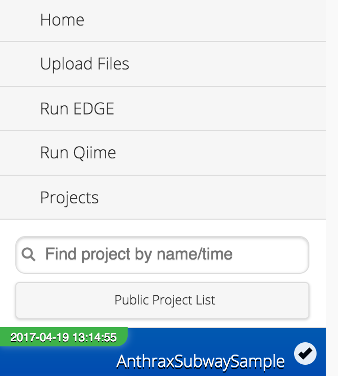
8: EDGE: Metagenomics profiling
Look at the taxonomic assignment heatmap:

- What are the likely sources of bacteria in this sample?
- Is the causative agent of anthrax present?
Group discussion:
- Is this expected? What might be going on here?
- How would we prove whether B. anthracis is really in this dataset?
9: EDGE: Is anthrax really on the subway?
Full tutorial here:
8: EDGE - monkey genomics
Sion will give a quick overview of this project and you can use the remaining time going through his tutorial: